Pari
Brand essence & screen design
Start
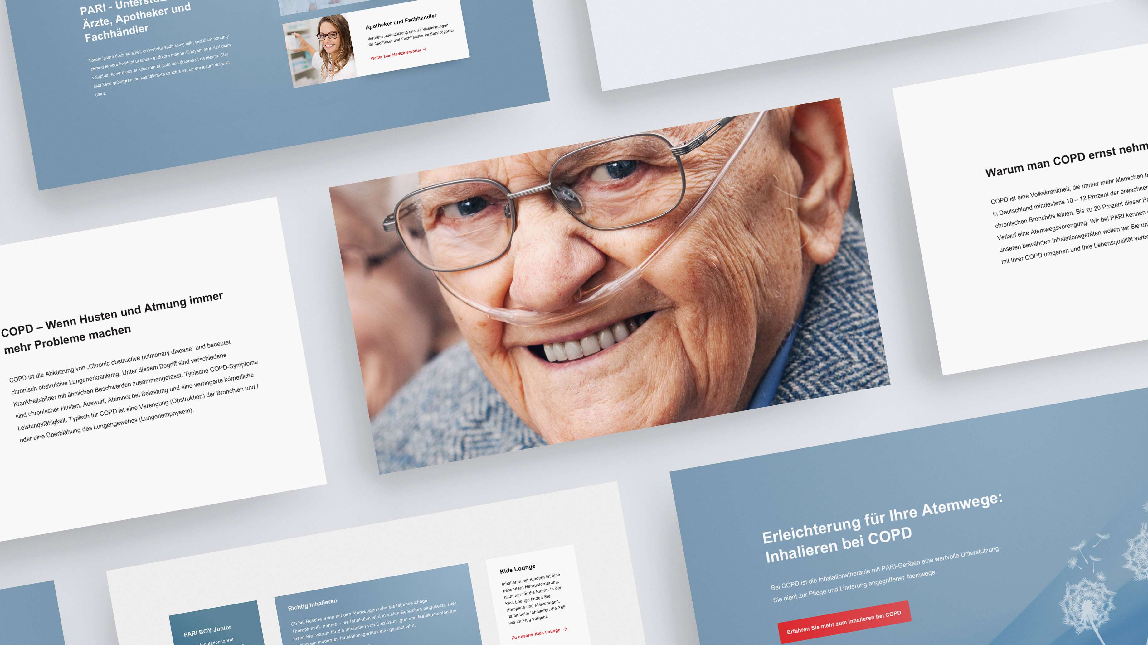
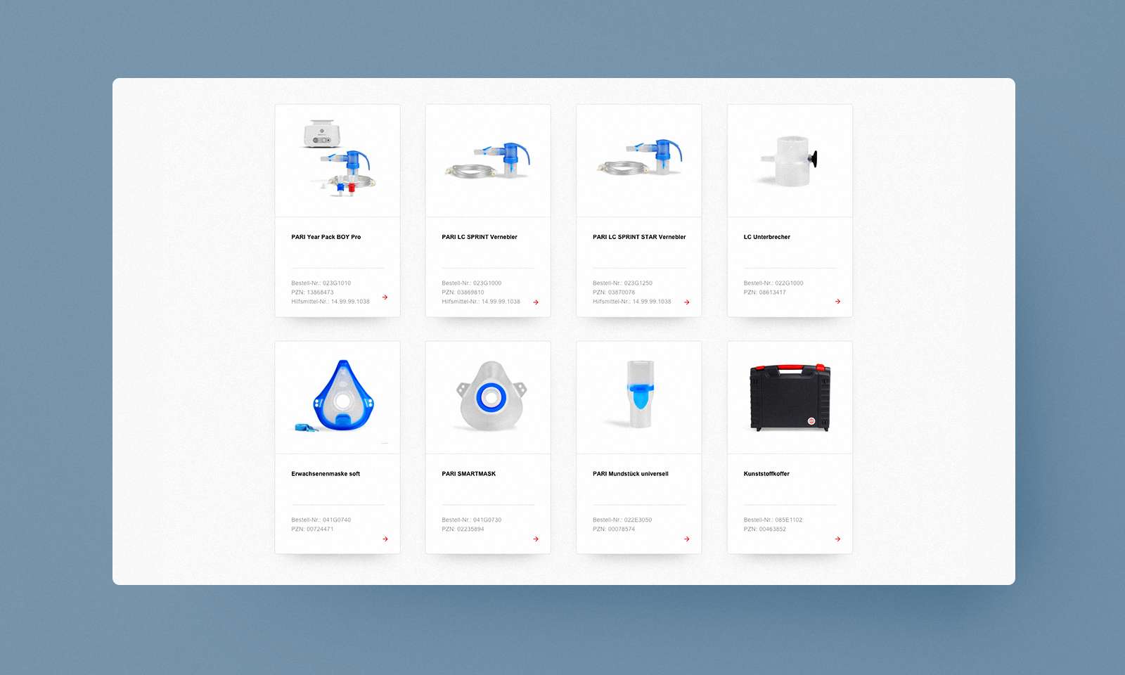
PARI offers special devices and inhalation solutions to treat lung and bronchial conditions. For the past several decades, the company has also been the world’s leading provider of nebulisers used to treat cystic fibrosis. Looking to the future, PARI wanted to be able to respond quickly to changes in product range, objectives, and customer expectations. What’s more, the company was keen to speed up its handling of priority issues, increase its brand recognition, and find a clear way of communicating its brand values.
Services
- Brand repositioning
- Content strategy
- Strategy for reframing communication
- UX & web design
- Design for the entire online presence
- Content creation
Finish
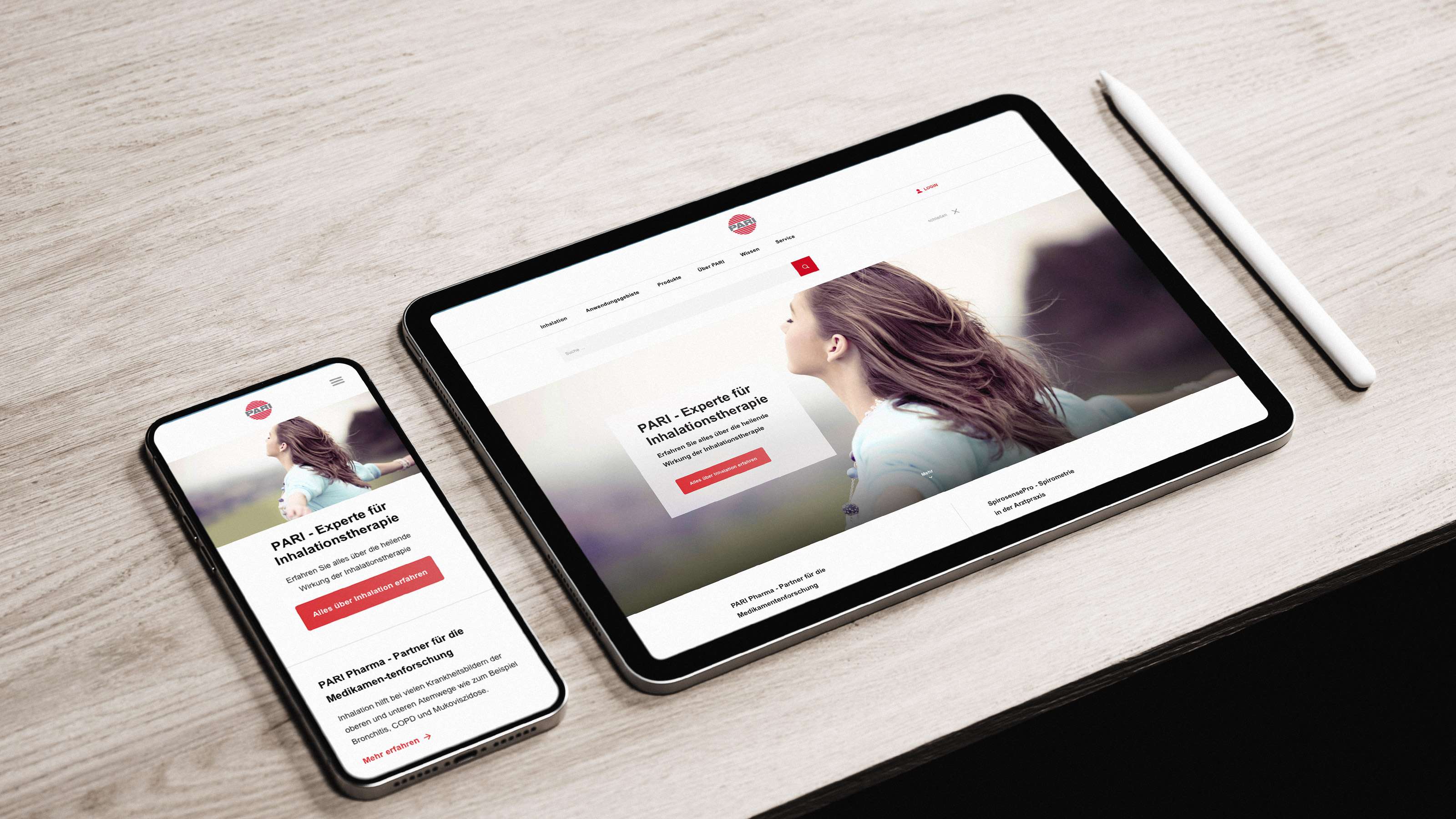
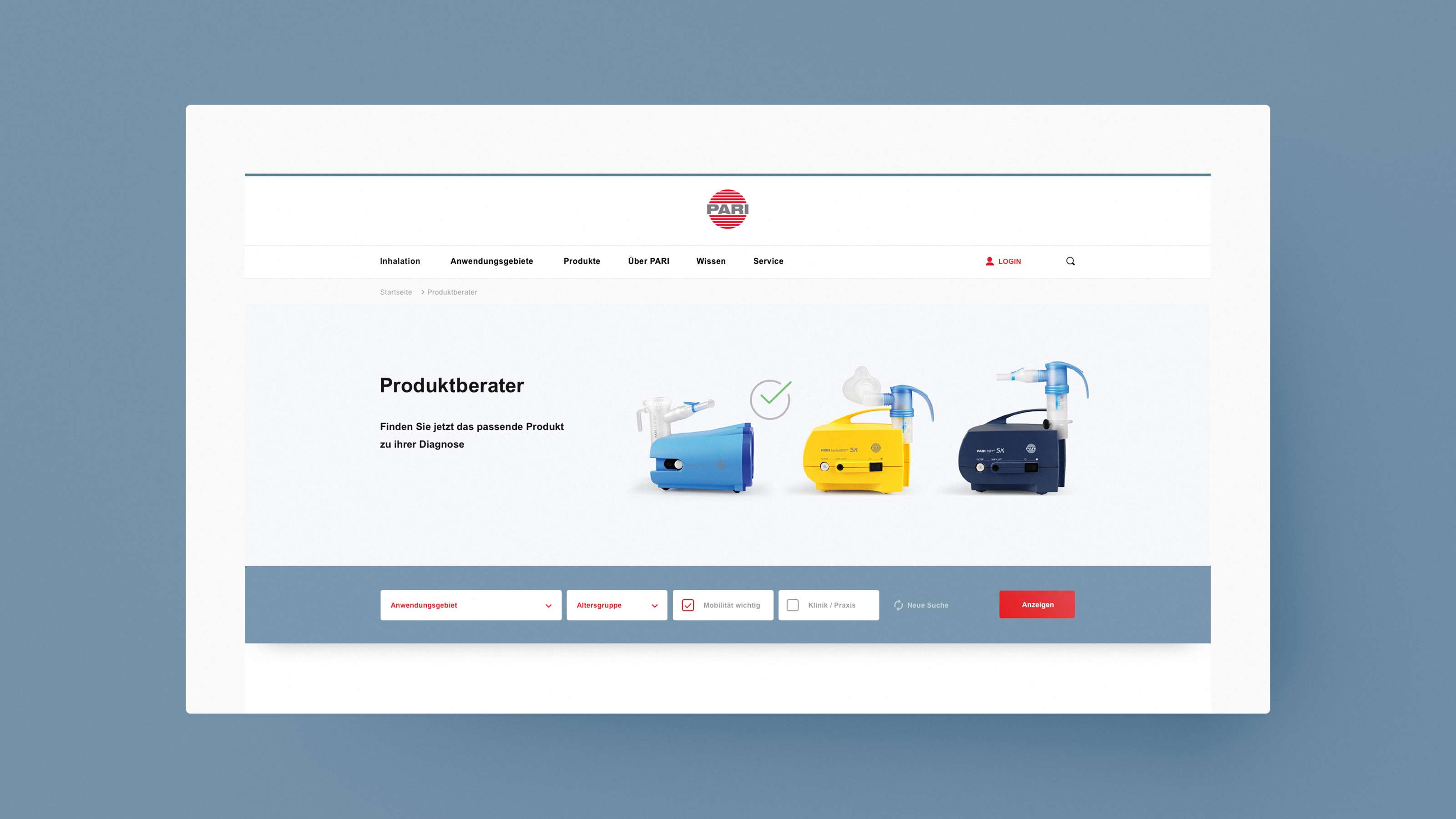
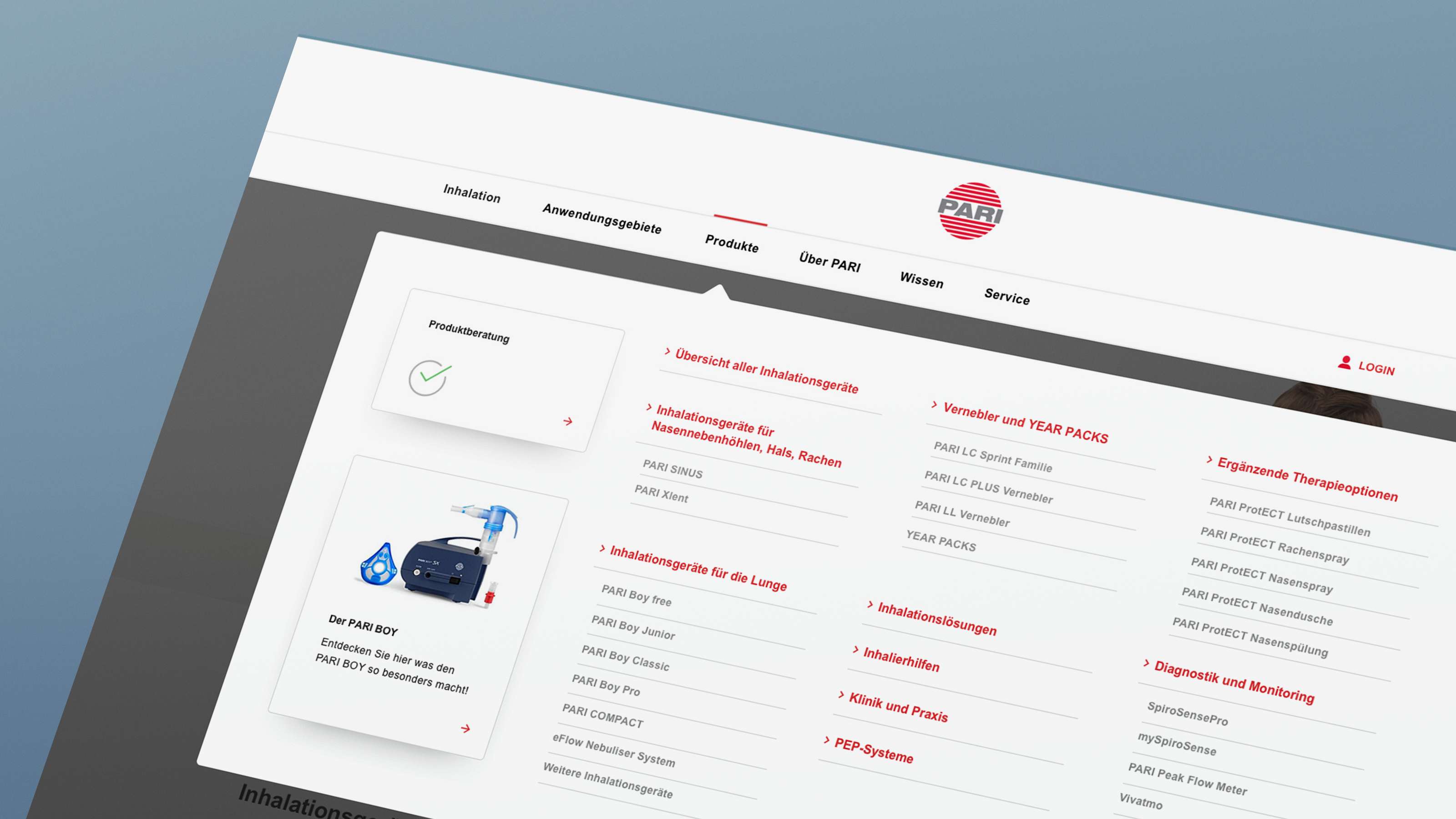
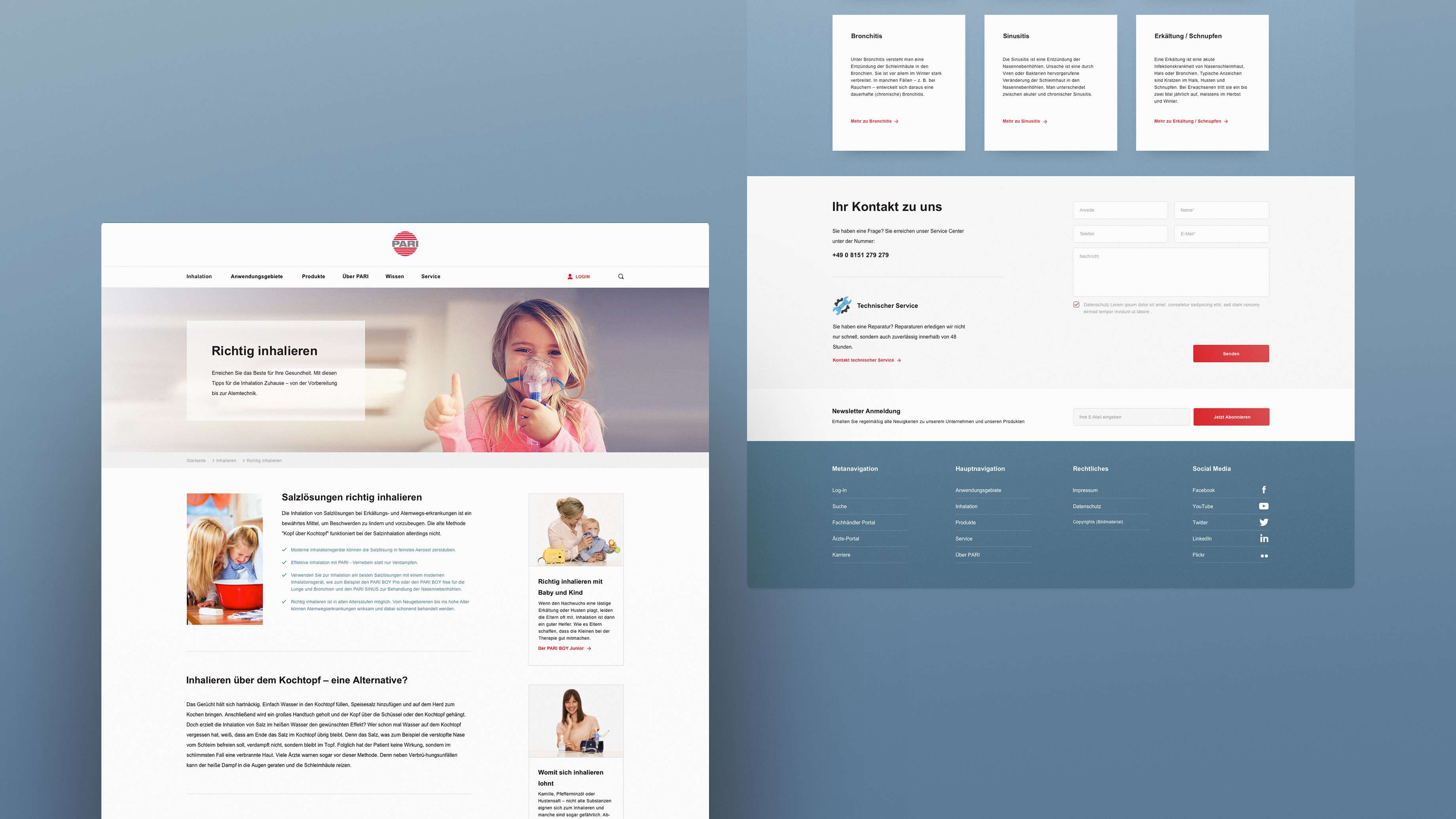
What began with a simple website briefing evolved into the complete repositioning of the PARI brand. Flavour used workshops to first develop a custom keyword strategy. With the help of customer journeys for the different target groups, the company’s focus shifted more towards patient needs. This is how we redesigned the brand essence to create a fresh screen design – with a modular structure and clearly worded copy.
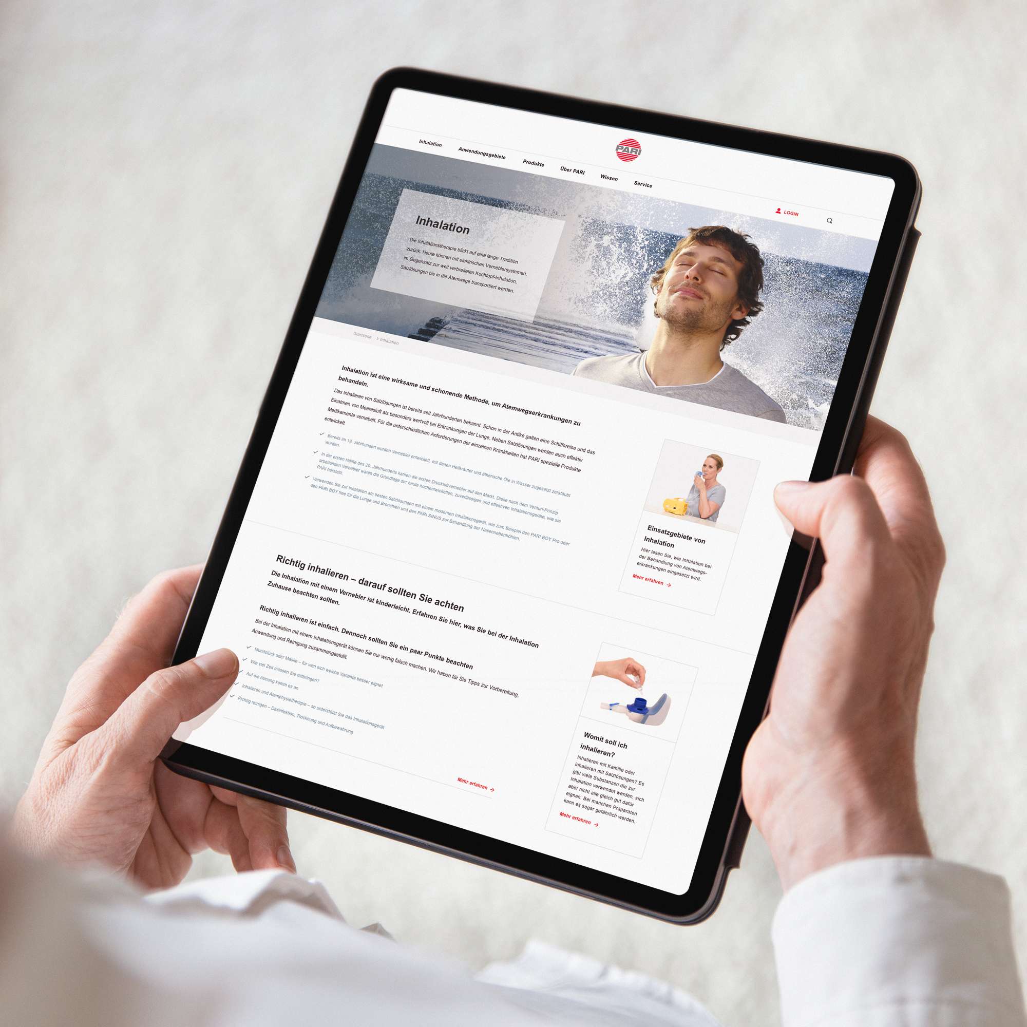

Medical technology made simple
Repositioning
The new brand essence makes the PARI range more accessible and tangible for the target groups
Additional value
Practical examples improve patients' quality of life